_forumlogo.png.a607ef20a6e0c299ab2aa6443aa1f32e.png)


Dmitry
-
Posts
4,386 -
Joined
-
Last visited
-
Donations
0.00 USD
Content Type
Profiles
Forums
Events
Blogs
Posts posted by Dmitry
-
-
Leo Records is going out of business?!
-
Wish I knew sooner...they haven't updated their FB page since 2019. I follow it, but it's been bupkis.
-
The in-print book,
Graham Marsh, Glyn Callingham The Cover Art of Blue Note Records: The Collection, Edition Olms, 2018. 240 p. ISBN: 978-3283012823
is a smaller format version (possibly a scaled-down facsimile, but I can't be sure, not having compared them) of these two out of print large format (just shy of the LP jacket size) soft cover books -
Ed. by Graham Marsh, Felix Cromey, Glyn Callingham Blue Note: The Album Cover Art, Chronicle Books, 1991. ISBN: 0-8118-0036-9
Ed. by Graham Marsh, Glyn Callingham Blue Note 2: The Album Cover Art , Chronicle Books, 1997. ISBN: 9780811818537
There are other later editions, some are on the reduced scale, but these two are the first editions, in large format.

-
4 hours ago, Big Beat Steve said:
Thanks very much for taking the trouble, Dmitry. But it confirms my suspicions: the author works on the principle that the owner is supposed to strictly like and appreciate all artwork from all decades alike.
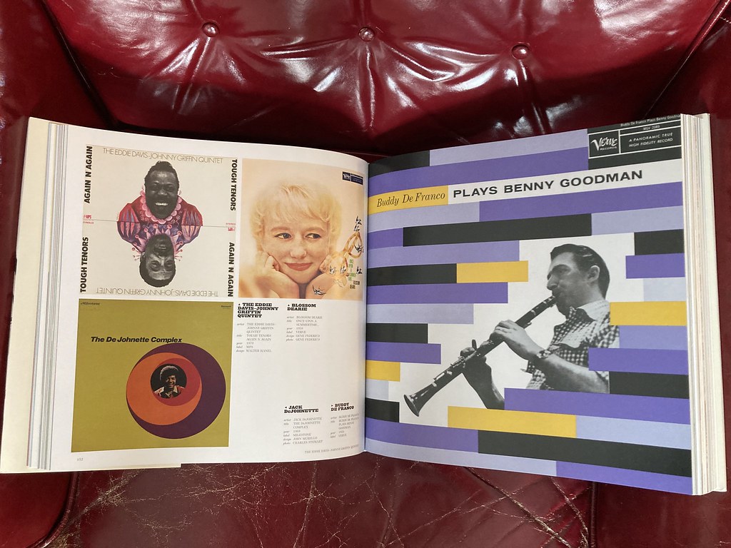
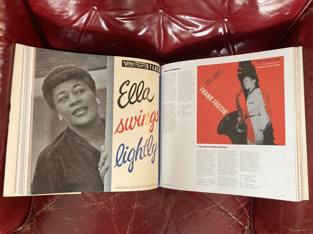
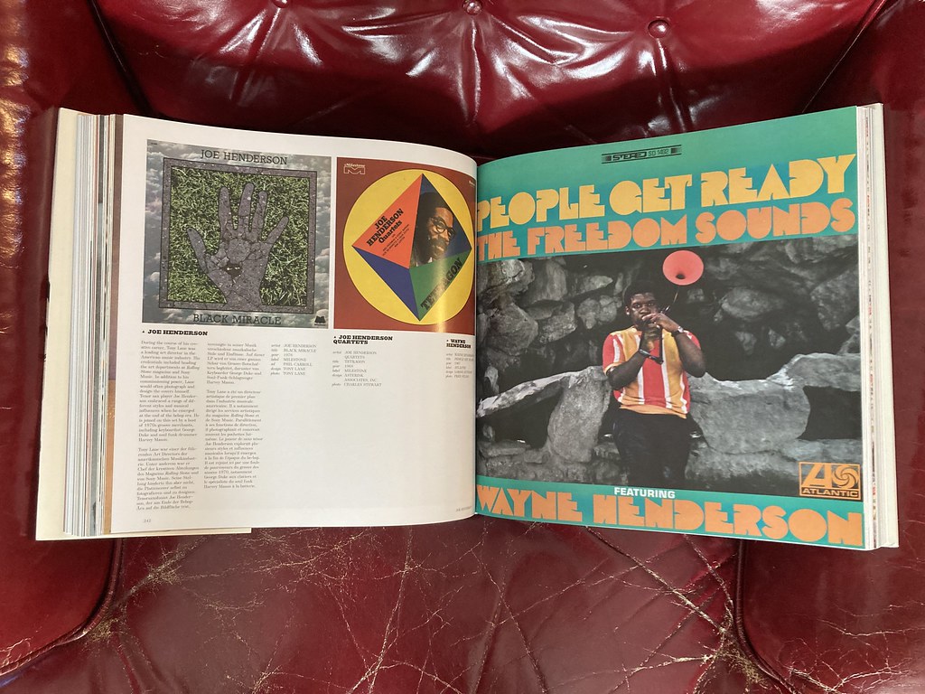
And I beg to disagree about the usefulness of alphabetically arranging the contents by the names of the artists covered. One single LP cover per artist is bound to be a random selection and does not say much (about the state or evolution of the graphic arts) if the next cover shown by the alphabetically next artist is from a totally different era and style. (cf. the online sample page of Eddie Condon's Coast to Coast Jam Session cover - incidentally IMHO the lesser of the period covers: the black-and-red cover of the European Philips pressing IMO is more striking - opposite the flower-power Chick Corea cover) The visual impact of the artwork representative of a certain period of the graphic arts is largely lost by this zigzagging between eras. Even when you select, say, 2 or 3 album covers per artist. ANY album covers of the output of ANY artist with long recording careers changed drastically through the decades. So what's the point proven, then?I would VERY MUCH have preferred a book of this size arranged chronologically by the periods covered (from the earliest to the most recent) to show the evolution of the graphic arts in this respect (including sidelines/variations of the development of typical artwork in each era/decade). Not to mention the fact that some truly striking cover artwork might have been found on LPs or EPs by "journeyman" jazz artists who do not rank among the greats of all times.
And just to explain my stance ... I guess I am somewhat interested in this kind of period artwork not least of all because of a personal bias: My Ma used to work in the graphic advertising arts for all her professional life (never any record covers, though). Long ago I took over a huge stack of her "international advertising art" monthlies that she used to subscribe to from her student days to the late 60s/early 70s. I kept those from 1950 to c. 1962/63 but sold off the later ones. Guess why (space limitations not considered): Because my main interest was and is the graphic arts of the earlier period (which BTW by the late 50s often had advanced to styles and designs that many would date to way later in the 60s if they weren't shown proof that these designs did exist as early as the late 50s).
So that's that, and tastes and preferences just differ ...")
The only solution I see for your demands is the electronic version which can be arranged by label, year, artist, designer, style etc. i find the “by jazz artist” arrangement just fine, but I see your point.
While working on this little project, it’s become clear that the Europeans and American editions of the same titles have different covers and different titles even…just like the albums. Blue Note especially is a perpetual and reliable cash cow for the publishers.
-
21 hours ago, Big Beat Steve said:
Actually, I had this book in my hands today when I dropped by a large bookstore downtown. But as it was sealed I was unable to look inside. What has kept me from springing for it so far was that I wonder what percentage of the contents is post-early to mid-60s.
Cover artwork-wise, my main interest really are the entire 50s (as well as the earlier the 78 rpm album era). But beyond the early 60s it sort of fizzles out. So I can live without huge chunks of psychedelic or funk covers.
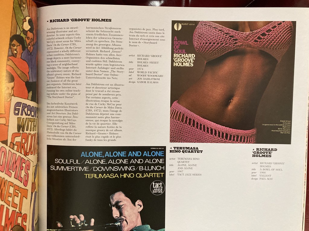
The sample pages you can check out online are somewhat strange and inconclusive. And I guess I would have to see the entire book to make something of its methodology. The mix and the stylistic jumps across the decades look odd to me. And I find the visual impact of the artwork is lost to a great extent in an alphabetic artist mix (which the book seems to have). Unless the book wants to force a "you got to like all artwork from all decades alike" attitude unto you.
There cannot remain much common visual ground if you just single out a scant few album covers by each artist from whatever decade. Neither would the impact be there if you arrange it by label (because most labels - that had longish existences - changed their artwork styles more or less drastically over time). "Jazzical Moods" with its "theme" layout makes more sense to me. But admittedly "that's only me".
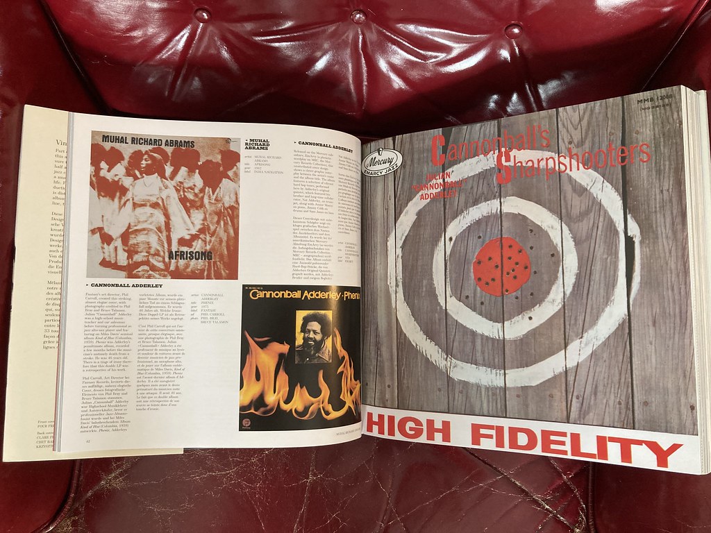
Judge for yourself. I do think it's a correct and encyclopedic way of compiling the artwork by alphabetical names of the artists, whose albums are being represented. The author did quite a bit of research on the designers/graphic artists. I think this book is a keeper. It is a giant folio, as you witnessed in the bookstore.
-
16 minutes ago, Dub Modal said:
I was looking to get further insight on this peek into the power of idiocy but it’s paywalled
Just read this myself.
See if you can spot a further bit of demonic humor (indadvertant, I'm sure) all the way at the end of the article. I did.
-
Poland cancels 666 bus route to Hel amid complaints of “spreading satanism”.
https://www.telegraph.co.uk/news/2023/06/14/poland-hel-bus-666-gdansk-satanism-christians-catholic/ -
Thank you!
I ordered the Freedom, Rhythm & Sound, the California Cool, and the Steinweiss folio. The Blue Note and other cover books edited by Graham Marsh appear to be recycled and volumes combined under slightly-different titles.
For my part, I really recommend the recently-published Joaquim Paulo, ed. Julius Wiedemann Jazz Covers, Taschen GmbH, 2021. ISBN: 978-3-8365-8525-5
As with some other Taschen titles, including this one and the Steinweiss book, there are smaller and larger format versions. I do recommend springing for the larger one.
One other elusive jazz cover book is this one: The Color of Jazz: Album Cover Photographs by Pete Turner. https://www.amazon.com/dp/0847857980/?coliid=I2A913CV21ZB1J&colid=1J6EMQXK3XD10&psc=1&ref_=list_c_wl_gv_ov_lig_pi_dp
-
I'm compiling literature for a school project relating to jazz album covers and need your help organizing a list of books published on this topic.
These are the books I have in my small library:
Ed. by Graham Marsh, Felix Cromey, Glyn Callingham Blue Note: The Album Cover Art, Chronicle Books, 1991. ISBN: 0-8118-0036-9
Ed. by Graham Marsh, Glyn Callingham New York Hot: East Coast Jazz of the 50s and 60s. The Album Cover Art, Chronicle Books, 1993. ISBN: 0-8118-0416-X
Manek Daver Jazz Album Covers: The Rare and the Beautiful, Graphic-sha Publishing Co., Ltd, 1994.
Richard Havers Blue Note: Uncompromising Expression , Chronicle Books, 2014. ISBN: 978-1-4521-4144-2
Joaquim Paulo, ed. Julius Wiedemann Jazz Covers, Taschen GmbH, 2021. ISBN: 978-3-8365-8525-5
Irwin Chusid, Chris Reisman SUN RA: Art on Saturn. The Album Cover Art of Sun Ra's Saturn Label, Fantagraphics Books, Inc., 2022. ISBN: 978-1-68396-658-6
I am sure there is more out there, especially printed in foreign lands.
-
Now that we are on to them , I do remember some iffy Time magazine headlines from the imaginary past:
Covid may turn into China's plague.
9/11 could become America's Pearl Harbor.
Boots Randolph's new hit makes him the saxophone colossus.
-
2 hours ago, Dan Gould said:

No f...ing way. I had to look it up...it's true. For me, this is more than enough to sack the journalist who wrote it and the editor.
-
On 4/12/2023 at 6:19 AM, Big Beat Steve said:
But what baffles me here is that they should have kept clearly outdated label addresses and affiliations (such as in the case of Impulse as part of ABC Paramount in the case of an MCA-era record inside) without sticking an update label on. (I've seen such stickers elsewhere) I should have thought that label owners would be a wee bit touchy about getting this right.
It baffles you because you are a German. Order, common sense and accountability aren’t as widespread in most other places around the world.
As to the Impulse! question, yes, like the others, I see the 1970s MCA records in the earlier gatefolds fairly often. It’s kind of a brief nuisance when you think you just scored a nice OP, and then fish out a 120 g. MCA lp.
-
3 minutes ago, bresna said:
In general, I think it's weird but I'm sure with time, I'll get used to it.
Will you get used to it when heroin is legalized in the state if Maine? That day may come eventually.
-
3 hours ago, mjazzg said:
Not sure that Lukaku is terminally unlucky as opposed to terminally incompetent!
I didn't see the game as not on free to air here. For all the positives about City's style of football I still think there's a sour taste of potential financial doping. Not until that is cleared up will I remove the asterisk against their competition wins.
I was being generous. After all, he continues to play for the best clubs in Europe (for whatever reasons)...
City did not own the midfield, like they usually do. Haaland was covered solid, and didn't produce much. Overall, not a great game from MC, but they did lose, in my opinion, the best player in the world after 30 minutes, when De Bruyne pulled his hemi.
28 minutes ago, Brad said:For the above reasons I was rooting for Inter. Middle Eastern money is on its way to ruining one sport (golf) and now it has ruined football.
I was rooting for Inter also. Their defensive game was excellent. Plus, Man City is awash in Sheikh Mansour's dinars. Guardiola is an amazing manager, no doubt.
-
Got mine today. Luck was on the side of those that deserved it! The padded envelope had a big chunk torn out of it, but the cds came out unscaved, and were in the "as described" condition. Thanks, ejp626!

-
5 hours ago, adh1907 said:
What a night! Solid performance from City, Inter fouling throughout then suddenly discovering how to play football after going one goal down. Watching in Madrid, free to view here, avoiding Real Madrid fans!
City made history, but not without struggle. If not for the terminally-unlucky Lukaku, things may have been different. In the last 10 minutes Inter made good chances in the box, but luck wasn't on their side, it was all doled out to Ederson, who was City's man of the match. Congrats to the City fans!
-
 On 6/6/2023 at 11:40 AM, Rooster_Ties said:
I'm sorry, but I didn't get it. I'm sure it's me.
-
Told you, it is everywhere. The mystique of weed is gone. It's become a crutch of the Generation Z. It concerns me.
-
4 minutes ago, Rooster_Ties said:
Someone should grab this one — an utterly fantastic release, that I’ve revisited numerous times. Perfect sound quality, strong and inspired performances, and Hank’s only(?) recorded appearance fronting a big band.
You are a savvy listener. I'll go with your recommendation.
I'll take :
Bennie Green Soul Stirrin' (Blue Note - TOCJ) - 6
Hank Mobley To One So Sweet, Stay That Way (Dutch Jazz Archive) - 12Thanks!
-
8 hours ago, JSngry said:
About halfway through, Threadgill's just back from Viet Nam and picking back up on his composition studies.
To 5his point, this is one of the better (and better written) ",jazz books" I've ever read. A compelling story compellingly told.
Any mention of someone named Frank in the book?
-
-
We saw him in August 2019 at the Jazz Forum in Tarrytown, NY. Trio with Paul Bollenback and Carmen Intorre. I liked how he played Misty.
-
Sarah B. Pomeroy - GODDESSES, WHORES, WIVES, AND SLAVES: Women in Classical Antiquity
Illuminating and pioneering.
-
25 minutes ago, sidewinder said:
Looks like a pair of pimply knees to me !
I saw that also, but chased that thought away...it's just weird.

"Leo Records Closing Down Sale" ‽
in Offering and Looking For...
Posted
Surely. Surprised he didn't sell it.